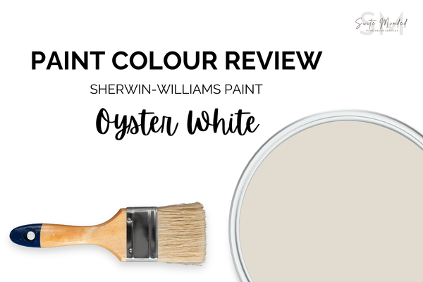
Sherwin-Williams Oyster White SW 7637 - Paint Colour Review
If you’re searching for a neutral that feels calm, warm, and slightly earthy without leaning too beige or too grey, Sherwin-Williams Oyster White might be exactly what you’re looking for. Oyster White is one of those colours that quietly works in many homes. It doesn’t demand attention, but it creates a soft, relaxed backdrop that feels welcoming and easy to live with.
In this review, we’ll look at Oyster White’s undertones, how it behaves in different lighting conditions, its LRV, the best trim colours, and some beautiful coordinating colours to help you decide if it’s the right fit for your home.
What are the undertones of Oyster White?
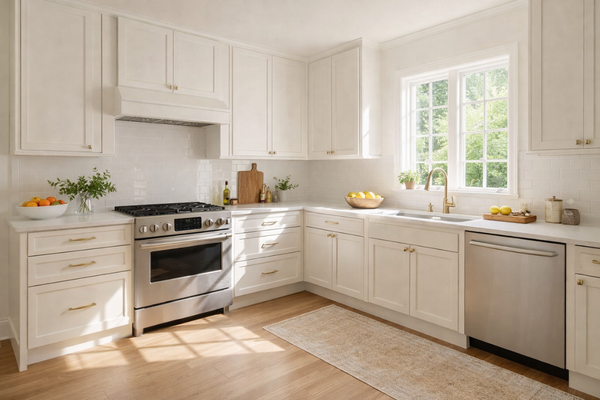
Oyster White is a warm off-white with greige and subtly green undertones. At first glance, it can look like a soft beige or greige. But when you look more closely, especially next to true beiges, you’ll notice a gentle green undertone running through it.
This green undertone is what gives Oyster White its soft, earthy quality. It prevents the colour from feeling too grey or too creamy, which is a common problem with many warm neutrals.
Because of that slight green influence, Oyster White often works beautifully in homes that use natural materials like:
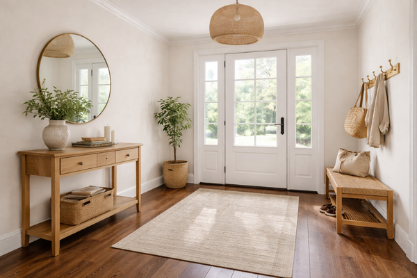
light oak or walnut flooring
linen fabrics
rattan or cane furniture
stone or marble surfaces
warm brass or bronze hardware
Instead of fighting these materials, Oyster White tends to blend naturally with them, which is one of the reasons designers often reach for it.
What is the LRV of Oyster White?
LRV (or Light Reflectance Value) measures how much light a colour reflects on a scale from 0 (pure black) to 100 (pure white). With an LRV of 72, Oyster White sits comfortably in the light neutral range, edging on the light greige and off-white range. It’s light enough to brighten a room, but it still has enough depth to avoid feeling stark or clinical, and provide a subtle touch of colour. This balance makes it a great option if you want a soft wall colour that still feels warm and welcoming.
Compared to some popular Sherwin-Williams colours:
Sherwin-Williams Alabaster: LRV 82 (lighter and creamier)
Sherwin-Williams Greek Villa: LRV 84 (brighter white)
Sherwin-Williams Accessible Beige: LRV 58 (much deeper, muted beige)
Oyster White sits right in that sweet spot where it reads as light but still has personality and character.
How does Oyster White look in different lighting conditions?
Like all neutrals with subtle undertones, lighting plays a big role in how Oyster White appears throughout the day.
In north-facing rooms, the light is cooler and more muted. In these rooms, Oyster White may show a little more of its grey-green undertone, giving it a calm, slightly cooler feel. The colour still remains soft and neutral, but it will feel less warm than in sun-filled spaces.
South-facing rooms receive warm, consistent sunlight. In this light, Oyster White tends to look warmer and creamier, and the green undertone becomes more subtle. The result is a relaxed, welcoming neutral that feels cozy without looking yellow.
In east-facing rooms, the morning light is bright and warm. Oyster White will appear light and slightly warm in the morning, then become softer and more neutral later in the day.
In west-facing rooms, the light becomes warmer in the afternoon and evening. During those hours, Oyster White may look a little warmer and more beige, which many people find very inviting.
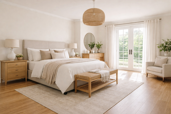
Where to best use Oyster White
Oyster White is incredibly versatile and works well throughout the home. Some of the best places to use it include:
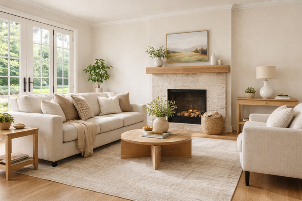
Living rooms where it creates a calm, welcoming backdrop for furniture and decor.
Bedrooms where the soft warmth makes these spaces feel relaxed and restful.
Open-plan homes: its balanced undertones help it flow nicely between connected spaces.
Hallways and entryways to help keep these areas feeling light without looking stark.
Kitchens: Oyster White works beautifully with warm woods, soft whites, and as a cabinet colour.
Consider it as well on exterior walls and trims for a soft, earthy, natural look.
Best white trim options with Oyster White
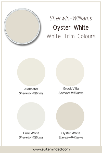
Choosing the right trim colour helps Oyster White look its best. Because it’s warm and slightly muted, it pairs best with soft whites rather than crisp, icy whites. Here are a few excellent trim options:
Sherwin-Williams Alabaster: A soft, creamy white that complements Oyster White’s warmth beautifully.
Sherwin-Williams Pure White: A versatile white that creates a gentle contrast without looking too stark.
Sherwin-Williams Greek Villa: A slightly warmer white that pairs nicely in bright spaces.
If you prefer a more subtle look, some homeowners even use Oyster White on both walls and trim for a soft, monochromatic effect.
Best coordinating colours
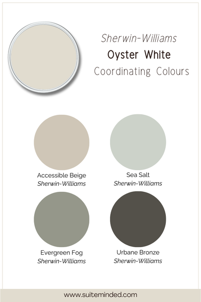
Because of its soft greige base and subtle green undertone, Oyster White pairs beautifully with a range of calm, natural colours. The key is to work with tones that feel muted and organic, rather than very bright or high-contrast. Here are some colour families that work especially well with it.
Soft neutrals: Colours like Sherwin-Williams Accessible Beige help maintain the relaxed, layered look that Oyster White naturally creates. Since it sits between beige and grey, pairing it with other warm neutrals keeps the palette feeling cohesive. They’re especially useful in open-plan homes where you want subtle variation without disrupting the flow.
Soft greens: Because Oyster White has a gentle green undertone, soft green paints, such as Sherwin-Williams Sea Salt or Evergreen Fog, feel particularly natural alongside it. Instead of competing, they tend to echo the undertone and create a calm, nature-inspired palette.
Deeper contrast colours: If you’d like to add some depth and contrast to the palette, deeper tones, like Sherwin-Williams Urbane Bronze or Iron Ore, can work very well with Oyster White. Because the base colour is fairly light, darker accents help anchor the space and create visual balance.
Is Oyster White the right colour for your home?
Sherwin-Williams Oyster White is a beautiful option if you want a soft, warm neutral with a subtle, earthy feel. Its gentle green undertone gives it more depth than many typical greiges, helping it feel natural and relaxed rather than flat.
If you love neutrals that pair well with wood tones, natural materials, and soft whites, Oyster White can be a wonderful choice for walls throughout the home.
As always, I recommend testing a sample in your own space first. Paint colours can shift quite a bit depending on lighting, flooring, and surrounding materials. But when it works, Oyster White creates a calm, effortless backdrop that makes a home feel warm, natural, and inviting.
Thank you for reading, and happy painting!
Manon xx